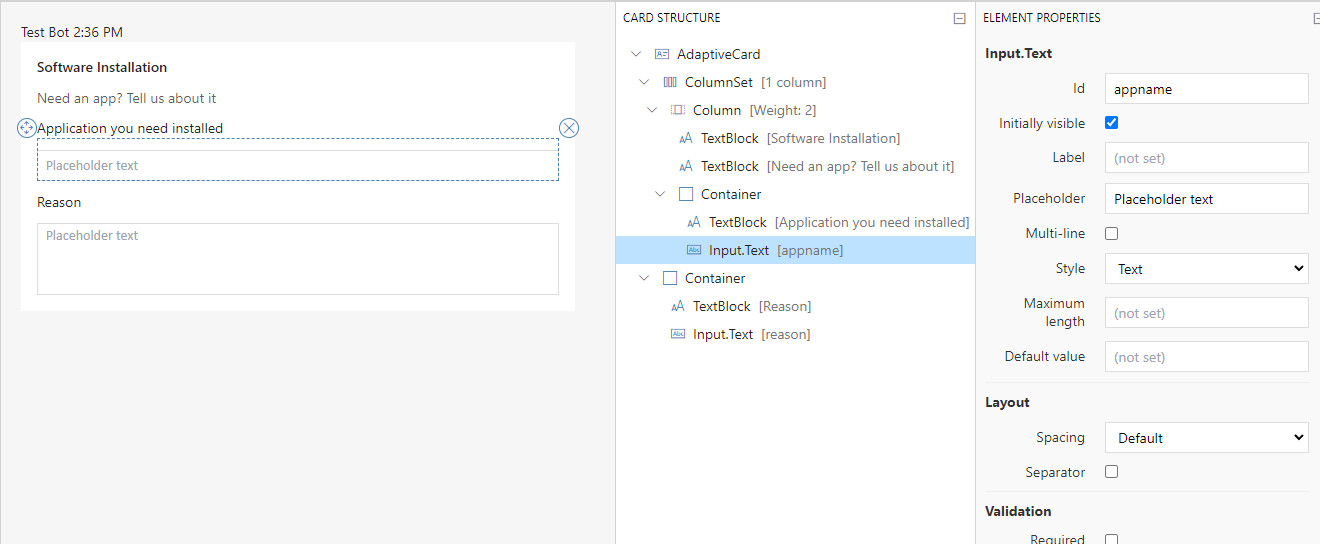
Templates are great to quickly set properties on tickets and request additional information from requesters. Templates can be used in ticket deflection and manually applied to existing tickets to quickly gather info from users to follow established business processes.
To access and manage the Templates settings page:
- Open the Tikit web app at https://web.tikit.ai.
- Once in the Tikit web app, select the settings Gear in the header, then select Templates.
- Hover over the labels or check out the following key section for more details.
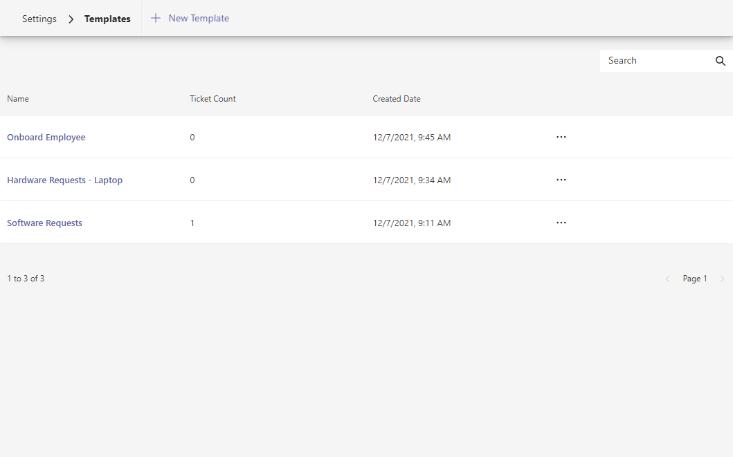
Select to view and edit template details. 3 of 6 4 The number of tickets with the template applied.
This counts tickets created using the custom form by HelpBot and where analysts have manually applied the template to a ticket. 4 of 6 5 The date the template was created. 5 of 6 6 Additional options, including Edit and Archive. 6 of 6
- Add Template Add a new template.
- Search Search for specific templates.
- Name Template name. Select to view and edit template details.
- Ticket Count The number of tickets with the template applied. This counts tickets created using the custom form by Tikit Virtual Agent and where analysts have manually applied the template to a ticket.
- Created Date The date the template was created.
- More Options Additional options, including Edit and Archive.
To add a new template:
| Field | Required | Description | Example |
|---|---|---|---|
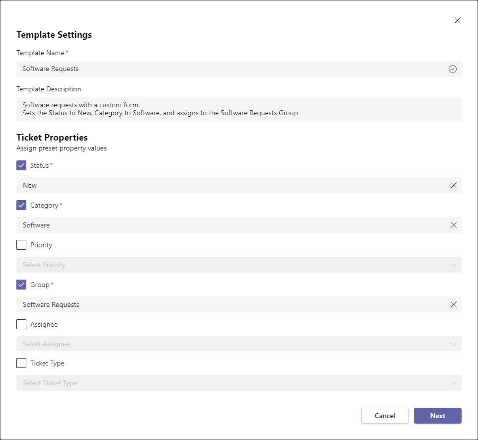
| Template Name | Yes | Display name for the template. This value may contain spaces. | Software Requests |
| Template Description | Description for the template. |
Software requests with a custom form. Sets the Status to New, Category to Software, and assigns to the Software Requests group. |
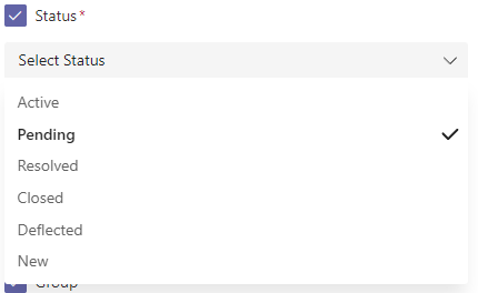
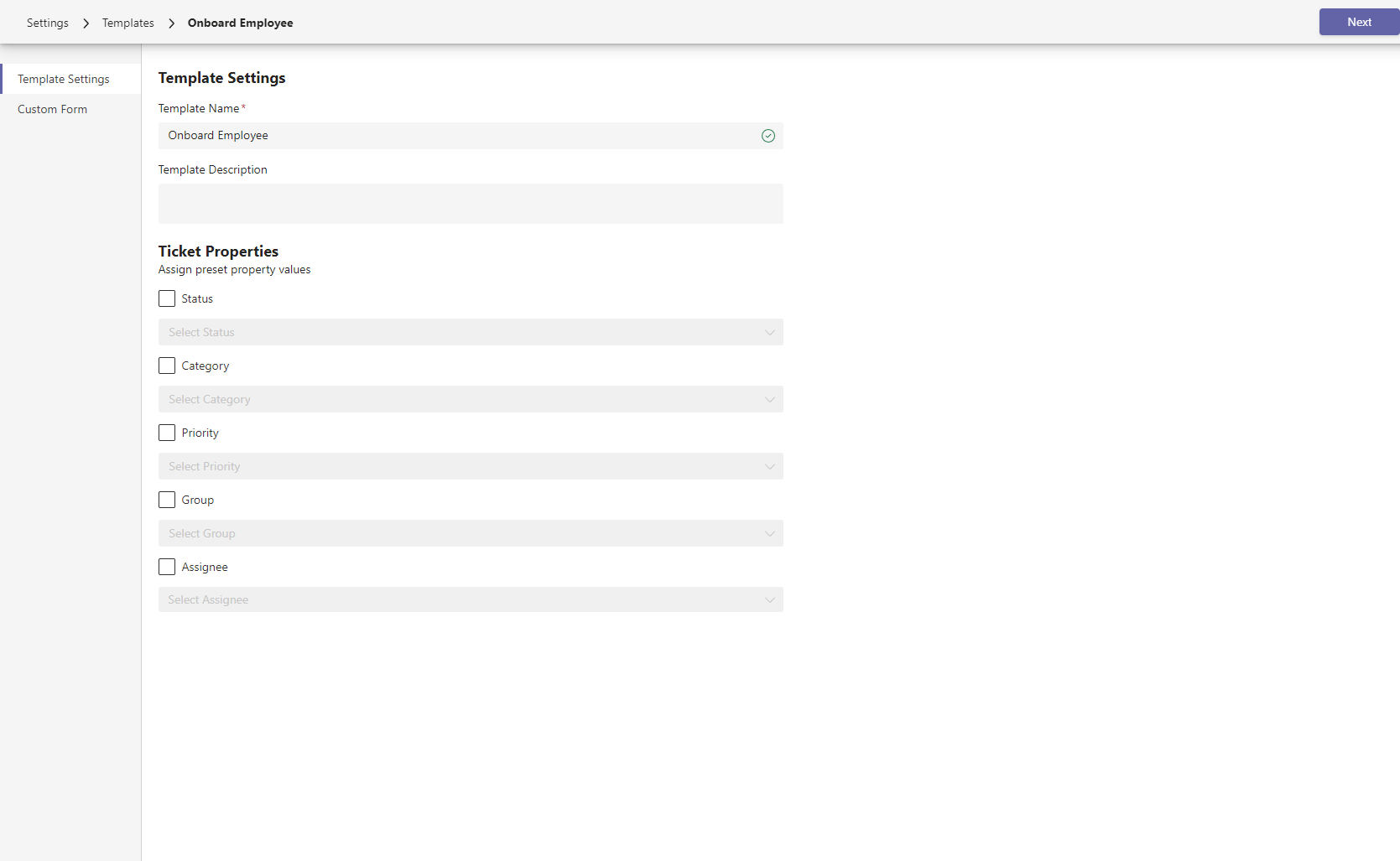
- Optionally, templates can assign preset property values. To set a preset value in the template, enable the property by selecting the checkbox, then select a value. Disabled properties will not be changed when applying a template.
- Select Next to continue.
Note that optional fields like Category, Group, and Assignee properties support unsetting or unassigning by selecting Unset from the dropdown. Note that one or more properties may not be available based on your current plan. For more information on plans and comparing features, check out Pricing.
- Once in the custom form designer, update the custom form to add/remove fields and optionally add validation, then select Save. To learn more about the designer, check out custom form designer below.
Congrats on creating a new template! The template can now be used in the ticket deflection knowledge base as a response or directly applied to an existing ticket request additional information from a user.
To update an existing template:
| Field | Required | Description | Example |
|---|---|---|---|
| Template Name | Yes | Display name for the template. This value may contain spaces. | Software Requests |
| Template Description | Description for the template. |
Software requests with a custom form. Sets the Status to New, Category to Software, and assigns to the Software Requests group. |
- Optionally, update preset properties in the Ticket Properties section. To set a preset value in the template, enable the property by selecting the checkbox, then select a value. Disabled properties will not be changed when applying a template.
- Select Next to continue.
Note that optional fields like Category, Group, and Assignee properties support unsetting or unassigning by selecting Unset from the dropdown. Note that one or more properties may not be available based on your current plan. For more information on plans and comparing features, check out Pricing.
- Once in the custom form designer, update the custom form to add/remove fields and optionally add validation, then select Save. To learn more about the designer, check out custom form designer below.
Need to retire a template? Templates can be archived to mark them as no longer available in the web app while keeping existing ticket counts for reporting.
To archive an existing template:
Need to undo retiring a template? Archived templates can also unarchived as well.
To unarchive a template:
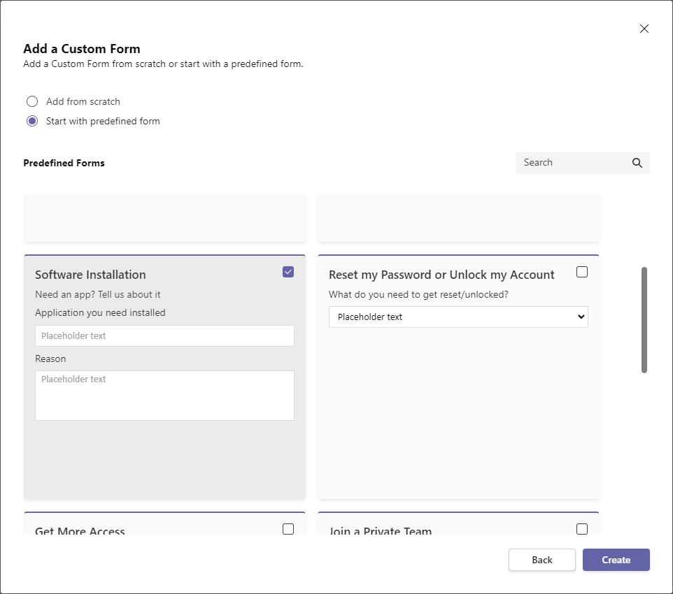
Display completely customizable forms in Teams using the custom form designer. The designer can be found when adding or updating a template. Create new custom forms from scratch or select a predefined form for inspiration!
- Hover over the labels or check out the following key section for more details.
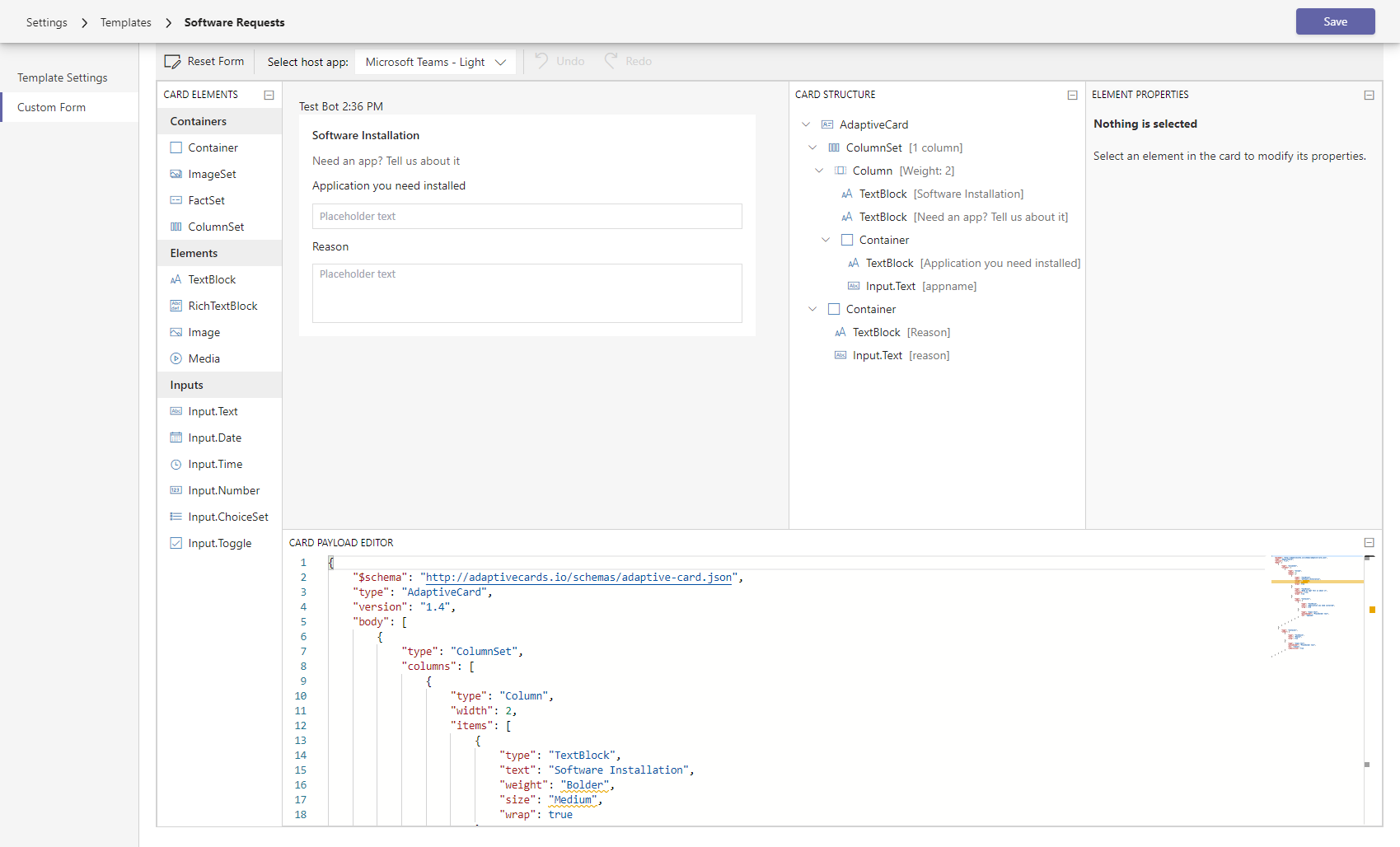
Advanced features like input validation and styling can be found here. 5 of 6 6 The card payload, or source code, that creates the form. Admins familiar with the Adaptive Card schema can update it directly here, but do so at your own risk! 6 of 6
- Toolbar Reset the form, preview in Dark/Light Teams themes, and Undo/Redo changes.
- Card Elements A tool palette of different elements to build the custom form.
- Card Area Preview and update the custom form with a WYSIWYG editor.
- Card Structure View and select form elements to update specific properties.
- Element Properties Element details and advanced features like validation and styling.
- Card Payload Editor The card payload, or source code, that creates the form. Admins familiar with the Adaptive Card schema can update it directly here, but do so at your own risk!
The Card Elements tool palette provides a selection of elements to add to the custom form. Card elements come in three types:
- Containers Arrange collections of child elements
- Elements Display information like text or images.
- Inputs Get input from the user.
To add an element, click and drag the element to the Card Area pane. To learn more about Adaptive Cards, see Authoring Cards
Containers
- Container Defines a a collection of elements.
- ImageSet Container of Images so that UI can show appropriate photo gallery experience for a collection of images.
- ColumnSet/Column Defines a collection of columns, each column is a container.
- FactSet Container of Facts.
Elements
- TextBlock Adds a block of text with properties to control what the text looks like.
- RichTextBlock Adds an array of inlines elements that support support different colors, font sizes, and styles.
- Image Adds an image with properties to control what the image looks like.
- Media Adds audio or video content content.
Inputs
- Input.Text Get text content from the user.
- Input.Date Get a Date from the user.
- Input.Time Get a Time from the user.
- Input.Number Get a Number from the user.
- Input.ChoiceSet Give the user a set of choices and have them pick.
- Input.Toggle Give the user a single choice between two items and have them pick
The Card Area provides a WYSIWYG preview and editor for the custom form that users will see. The editor has several features to quickly update form:
- View Select an element to view details in the Card Structure and Element Properties panes.
- Update Double click an element to update it directly from the preview.
- Reorder Drag and drop to reorder elements in the form.
The Card Structure pane provides a detailed view of the form’s elements. An element can be selected from both the Card Area and in the Card Structure pane. Select an element to view and update its properties.
The Card Payload Editor lets admins familiar with the Adaptive Card schema directly view and edit the source payload for a card. For more information on the Adaptive Card schema, see Schema Explorer.


